The logo brings the idea of simple sustainable living to life with uncomplicated typography set in harmony with a single, proud leaf. Nature builds with precision using balanced ratios and
harmonious symmetry. The Fernsby leaf is designed with the same principals and it represents the sustainable innovation we’ve learned from nature (and strive to restore).
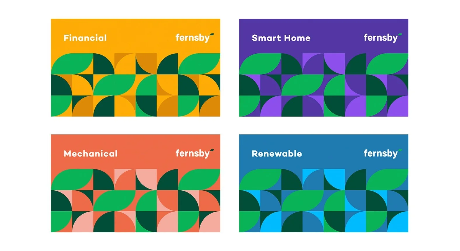
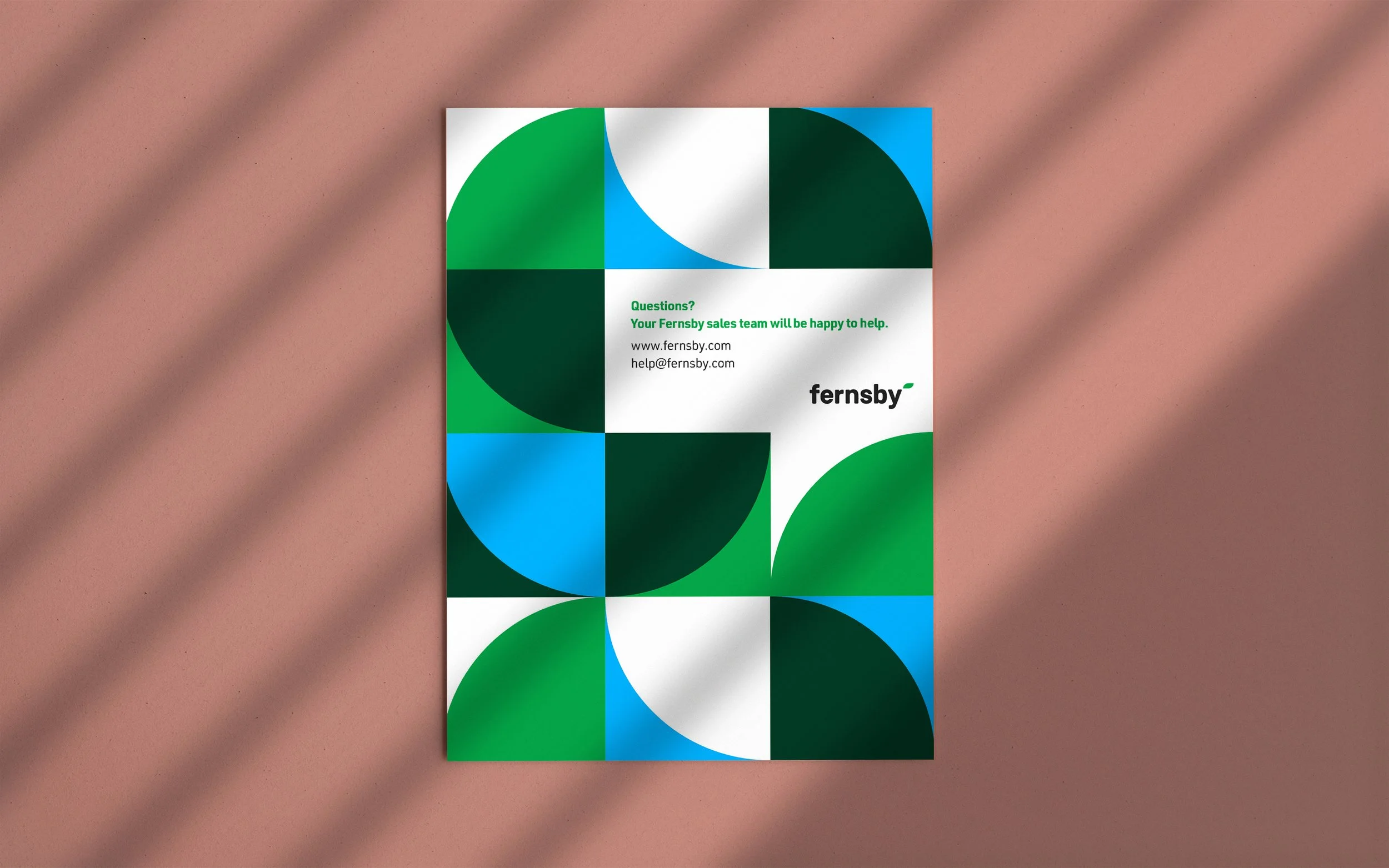
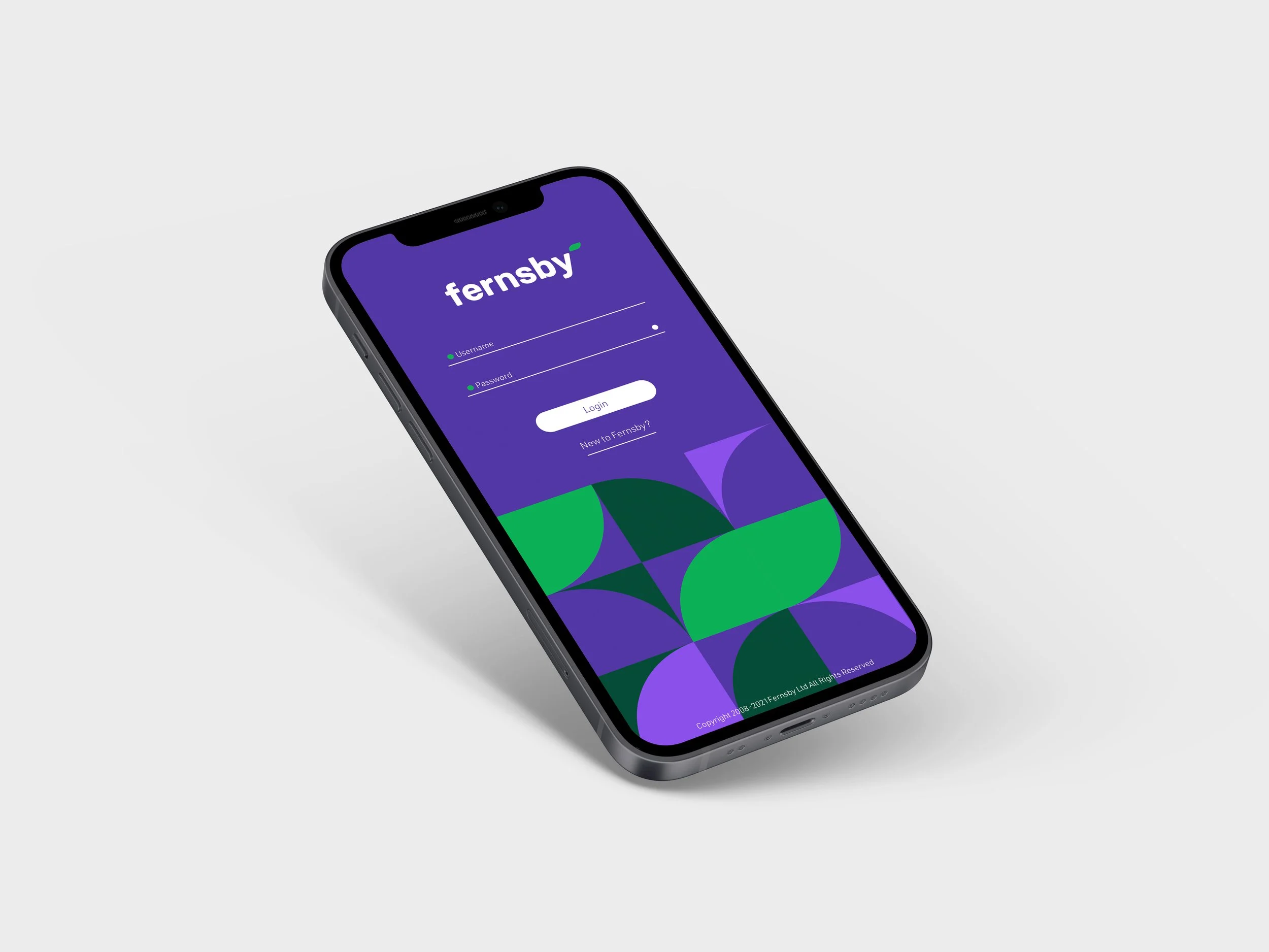
The vibrant, dynamic patterns created by our colours help differentiate our lines of business and can be used to brand our products. We can scale these motifs from small to very large to fill the space in a variety of beautiful ways.
Together, the Fernsby colours and geometry become our design system and patterns. Our leaf lives in the pattern too, showing up here and there in a subtle way to tie to each business.


